Mask II (2002) Ron Mueck
A girl (2006) Ron Mueck
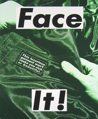
Mueck's sculpture is described as 'hyper-real'. Define the meaning of this term and apply it to his work.
Hyper-realism is an artistic style characterized by highly realistic graphic representation (“hyper-realism,” 2009). It is characterised in art by depiction of real life in an unusual or striking manner (“hyper-realism,” 2011). Mueck’s works are certainly hyper-real, graphically representing aspects of or the human form in striking larger than life or unusual miniature sculptures. The sheer size of his larger pieces are startling to the viewer and enable Mueck to show small details usually unseen on a normal sized human being, on a large scale for all to see. His smaller than everyday pieces show things usually unseen as a whole, completely. Both scales show the human figure in their most intimate, isolated and vulnerable moments (MacIntyre, 2010). While some of his sculptures seem grotesque and unappealing, I like them for their realistic qualities even on a non-human scale. I like Mask II for its calmness and serenity but find A Girl to be quite ugly which could be because of the facial expression of the girl and her puffy dangling limbs.
Mueck is not interested in making life size sculpture. Find out why he is more interested in working with the scale of the figure which is not life size, and mention 2 works which use scale that is either larger or smaller than life.
“I never made life-size figures because it never seemed to be interesting. We meet life-size people every day” (Tanguy, 2003). I like this statement from Mueck about his work and agree that what is different from what we see everyday either in miniature or in large scale always seems more interesting to see and more mind occupying than if it were in regular size. It makes you take notice in a way that you wouldn’t do with something that’s just normal (Tanguy, 2003).

The huge work Big Man could have been just a sculpture of a regular old man but when made to be on a dramatic and large scale, details can be observed about it, such as the fact that he has no hair whatsoever on his body and this makes it interesting and fascinating to look at. His human imperfections such as wrinkled skin and folds in his flesh due to his pose are noticed and make you wonder about this person as a human being and the movement of the body.

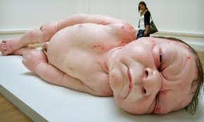
One of his smaller sculptures Mother and Child, of a naked woman who has just given birth with her newborn child crouched on her belly, in its tiny half-scale size allows you to see all the work and detail put into the artwork. Its realistic nature on such a small scale allows the viewer to see everything that is going on from the emotion on the mothers face to the tiny limbs of the baby all in one glance. Colin Wiggins, the curator for a show in the National Gallery where Mother and Child showed, commented that 'You [feel like you are] confronting a sacred object. You could see that it was communicating something in a visceral and emotional way’ (O’Hagan, 2006). Damien Hirst commented on Mueck’s work saying 'It's all about scale, not size. [Mueck’s work is] smaller than life-size and absolutely massive. It's so emotional that, once you see it, you can't get it out of your head’ (O’Hagan, 2006).
Define Renaissance Humanism, and analyze the term in order to apply it to an example of Mueck's work. Note that the contemporary definition of Humanism is much broader than the Renaissance definition.
Renaissance humanism is the rediscovery and re-evaluation of the aspects of classical civilization (de Bracton, 1994) of ancient Greece and Rome. In terms of art it was about rendering the outside world according to the principles of human reason (Blunt, 1962). Naturalism based on the scientific study of the outside world by the means of the weapons of perspective and anatomy (Blunt, 1962) was a major part of humanism in the renaissance along with realism. Mueck’s work is very humanistic with his studies of real-life models and photographs to produce his work, and his realistic portrayal of the human form in the final sculptures. This is seen in Mueck’s work Big Man. Mueck started with a smaller sculpture of a man wrapped in blankets done from his imagination. He found a model as close to the sculpture physically as he could and studied his figure closely observing what he could and couldn’t do in terms of poses that would appear as natural as possible. When the man sat down in the corner waiting for Mueck to decide what scale and pose to position him in he sat in this pose and Mueck liked it. He did a clay study about a foot high and took photographs of it and drew in a small person next to it in one of the images. Liking this scale he decided upon doing the final sculpture large scale and painting it so as it appeared weathered with age spots, veins and things so as he appeared as realistic as possible (Tunguy, 2003). I like the realistic qualities of Mueck’s works even on different scales to what is considered normal in human scale. I think the fact that his sculptures appear so realistic is what makes them so interesting as we as the viewer can see without imagining what the human form would look like on such scale be it larger or smaller. We can see what the details and aspects of the human anatomy appear like in different sizes and what is noticed standing out or only seen after close and lengthy viewing.
Research and discuss one of Mueck's sculptures that you might find challenging or exciting to experience in an art gallery. Describe the work, upload an image of the work, and explain your personal response to the work.

A work that I would find challenging to experience in an art gallery would have to be Dead Dad. The smaller-than-life-size sculpture of a naked, dead male is kind of creepy to me. ‘Laid out as if awaiting the mortician's blade’ (O’Hagan, 2006) is exactly how I would describe the sculpture. The limbs especially the hands just lying lifeless on the floor appear too still and make me uncomfortable with the idea of death displayed for all to see. The fact that it is only 3ft long and smaller that life is reassuring as we know from just the scale of it that it’s not a real person but it’s obvious ‘deadness’ is concerning. Mueck says that “I didn't really get on with my father but, as I made the piece, I found myself thinking about him, caring" (O’Hagan, 2006). This fact makes the work less chilling to me as if it helped Mueck feel better about his relationship with his father, it doesn’t seem quite so eerie and disturbing.
- Blunt, A. (1962). Artistic Theory in Italy 1450-1600. Oxford; Oxford University Press. (Pages 1-2)
- De Bracton, N. (1994) Humanism: An Introduction. http://www.byu.edu/ipt/projects/middleages/LifeTimes/humanism.html
- Hyper-realism. (2009). In the American Heritage® Dictionary of the English Language, Fourth Edition. Houghton Mifflin Company. http://www.thefreedictionary.com/hyperrealism
- Hyper-realism. (2011). On Merriam-Webster.com, an Encyclopaedia Britannica Company.
- MacIntyre, A. (2010, February 5). Ron Mueck's hyper-real sculptures come to Manchester, Feb 4-April 11. http://www.monstersandcritics.com/arts/news/article_1531151.php/Ron-Mueck-s-hyper-real-sculptures-come-to-Manchester-Feb-4-April-11
- O’Hagan, S. (2006, August 6). Ron Mueck: From Muppets to motherhood. http://www.guardian.co.uk/artanddesign/2006/aug/06/art2
- Tanguy, S. (2003, July/August 2003) The Progress Big Man A Conversation with Ron Mueck. http://www.sculpture.org/documents/scmag03/jul_aug03/mueck/mueck.shtml